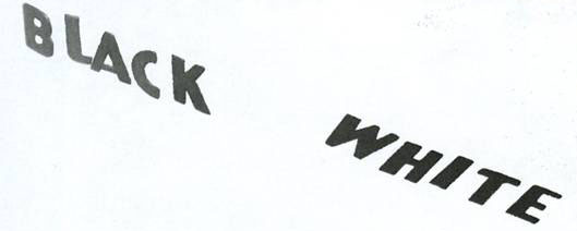
This is so wonderfull illusion! It was sent to me by one of our fans called Mike. Believe it or not, the “white” letters are actually darker than the “black” letters. This effect becomes clear when the surroundings are removed. You can jump inside this article to see the proof! This is what Mike wrote: “Found this magazine, Scientific American Mind, which had a good article about visual perception. Lots more in the June/July issue.”

I disagree. I cutout the letters and pasted them over the other colors words using photoshop. The “white” word that is shown without the surrounding background color is shaded darker than what is on the original picture. Try it for yourself.
This illusion absolutely blows my mind! I can’t believe it, how doooo they do it??? I love illusions!!! and i love all of you!
Love Always
Jacquie
The Blackreally looks blacker then the white
Hmmmm
I Simply don’t believe it…
Wow!!!
now that’s just weird…
that is so cool. my dad tryed to do it and said that you should ask which letters are darker because he thought the black side was it. well when I saw it without the backrownd it was amazing because it looks like the black is darker with everything, but when there is just the letters you can see the difference.
Yah! first comment! I find it hard to believe that the white is darker than the black. But I guess it must be true…
reely kool
Interesting! However, the white is not much darker than the black. Nonetheless, it is INTERESTING…
This is not true. The word “white” in the two images are not of the same color. This has nothing to do with perception. I suggest you take this illusion [sic] out.
Dark – (of a color or object) not reflecting much light; approaching black in shade.
In your illusion the white letters along with the white background are both reflecting all colors of light making them appear white while the black letters are absorbing all colors makin it appear black. So by definition black is always darker than white. On top of the fact that if your foreground is the same color as your background, your foreground will appear invisable.
So where is the illusion?
cool…i guess. its been done before though…
1st comment!
How is this possible?
Nice.. :)
Wow, cool, it sure tricked me!
I think that this has been one of the better illusions resently. pretty cool.
um i have looked over this many a times and still cant see how that is
wicked
woah, cool! when i look at the picture, i can’t even tell! i was so sure it was fake that i used the dropper tool in photoshop, but they actually are the same!
Wow. Just… freaking…WOW.
:S…. hahahaha. thats not an illusion !! xD its dummy :)
I have no idea what it is so byue!!
My favorite illusion of all!
This is better than the other checkerboard version.
Great site!
first reply awesome :)
ya this is koo, photoshop??
um,i dont get it.
I see these illusions all the time, but never know if it’s the colours are the same or the oposite to what you percived. This is one of the best though.
Wow, this is very confusing, but amazing indeed! :D
sorry but i don’t buy it!
no, thats wrong, i printed it out, cut the words out and the “black” word was darker than the “white” word. and the pic without the backround isnt the same as the original one. thats not an optical illusion at all.
Black,White are shade’s not colours so neither!!!
How does that work?
Wow. you’re right! I took the picture to paintpad and removed all the surroundings cause i couldnt believe it. and the white is much darker than the black! Who would’ve known?
that’s so cool! i’ve seen something similar with a chessboard or something.
one usual, bad ilusion.
P.S; I dont like it.
Wow. i have a book with illusions like that, but they still always get me!
i actually guessed right
i thought that the white seemed darker to me than the black
i dont know how i came up with that it was just natural instinct i guesss……
Wow! That is so cool. I have the widget and I just couldn’t figure out the answer so I came here. Astounding.
wow thtas really cool!
wow
wow.. that’s pretty amazing
Not too shabby. Saw something like this at an art gallery…
you are full of crap!!!!!!
WOW
THATS AMAZING !
I am a bit puzzled by the picture…the white is on the dark side, but the lettering is lighter then the other!! Question aren’t you supposed to see something else like a totally different picture!!??”
post another illusion or i will have to say that this site sucks
the colors are the same in photoshop. the “top/side” color of the BLACK is the same as the “face” of the WHITE. The “face” of the BLACK is the same as “front/edge” of the WHITE. The illusion works because the Black is standing and the WHITE is on its back.
to all the people who don’t believe the illusion… it was in scientific american mind, a peer-reviewed and intensely scrutinized scientific journal..pretty sure they’d have to check their sources before publishing this
it really does work
i opened it in photshop and paint and used the color tool that tells you the color of the pixel that you click
white is a big difference from black
(I tried posting already, but don’t know if it went through).
They’re actually both the same, if you take it from the perspective of shapes rather than words. The word “BLACK” is standing up, whereas “WHITE” is lying down. The top edge of “BLACK” matches the face of “WHITE”, and likewise the face of “BLACK” matches the bottom edge of “WHITE”, which corresponds to how they’re laying against the background.
This is real. Even if the two images are slightly different, I’ve tested this illusion before with the photoshop eyedropper right on the original images.
I have to disagree with steelcitykid, if you grab the original file and cut the words out and place them next to eachother you will see that the WHITE is Darker than the BLACK.Very Cooool Illusion.
THIS IS COOL MY EYES WERE GOING ALL FUNNY
Don’t know how you lot are doing it, but the white letters are way darker than the black in Photoshop.
I checked with photoshop and MS paint. In photoshop, I dragged the “white” without the background next to the other one. They are the same.
awesome – strange how your mind plays tricks on you
I think that it was obvious that the white was darker than black, if it wasn’t, then it wouldn’t be an optical illusion and wouldn’t be on this great site.
on photoshop, because of the pixels, we will get a different outcome compared to our eyes.. because white is lying back down, which makes it darker, doesnt mean it’s really dark. ALONG with the dark shadow, made it look black, so in photoshop, it captures the ‘dark’ colors and display it out on a white canvas, showing ‘white’ to be darker than ‘black’…. my opinion is they are the same :)
The illusion is based on the disparity between a 2-dimensional interpretation of the image and a 3-dimensional one. Your mind isn’t really playing tricks on you. Your mind is inferring the “color” of the blocks through experience. You know that white things appear darker at night. Think of walking through your house in the dark. Your mind assumes that color is constant (your sofa didn’t change colors when the lights went out). But the contrast changed because of the amount of light being reflected back to your eyes. But in your mind, you still “see” the original color of the objects.
I can’t believe that the white is darker. This is amazing!
The front of the white letters are indeed darker than the front of the black letters
You guys! This is NOT an illusion!
Get photoshop, put the word WHITE without the background ON the word white WITH the background, it is darker! Meaning the image was altered.
# Jinesh Jain on 8:30 AM
This is not true. The word “white” in the two images are not of the same color. This has nothing to do with perception. I suggest you take this illusion [sic] out.
…word.
“White” is indeed darker than “black”
r_berto
PowerChild
[M]ilt
sentin3l
are right!
Read there explanations or try it for yourselfs.
Still don’t believe it.. use your hand to hid the background over the monitor. ;)
One of the best ones i saw.
100% true. save pic. open in paint. zoom to large size. slide the pieces around. i’ve seen this before.. with the green cylinder and the checker boards… that also, is 100% true.
black and white are not colour dummies. neat illusion tho’.
Nice illusion.. but I liked the checkerboard version better..
WTC? :(-
kOoL
that really tricked my eyes
wow steelcitykid, you have a life
You’ve done this one before :(.
lol i agree with JJ on this one…. steelcitykid thats pretty pathetic
Very easy to tell that the white is darker because of the light that is shining on the black.
Very Cool,
Tony The Tiger
Hey, “whatever”, stop being so negative, this a great site! And its “illusion”
Great illusion! :)
OMG i cnt belive that the white is actually darker!!!!!!!!!!!!!………yea i can, get over it evry1 n get a life
if you have photoshop or even paint, use the turkey baster thing and white is darker than black and steelcitykid eventhough the two whites arnt the same the white is still darker.
i
Hey Max and Steelcitykid,
Sorry to say, you are mistaken. The picture is real.
I checked the shading out with my SnagIt editor and I used the Freehand selection tool to cut a fragment out of the letters. When you select part the “E” form the “WHITE” letters and move it around you will see that (1) the “WHITE” letters are darker than the “BLACK” letters, and (2) the shading of the letters in the first and second picture is identical. Don’t trust a printer for this kind of comparison.
I don’t need photoshop to see that the color of the word ‘white’ is darker than the color of the word ‘black’. It’s pretty obvious.
zzzzzzzzzzzz…huh…oh…BORING!!!!!!!!!
‘d shadow,,isn’t?
I copied into ‘Paint’, then used the sampler dropper to grab the ‘black’ colour first, drew an outline and filled it, then did the same for the ‘white’ colour, and there’s no doubt, the ‘white’ colour is very much the darker of the two
Does it really come to that much of a surprise that something will be brighter if you are shining a source of light on it compared to something you are not shining a source of light on?
Actually, the white is either the same shade of grey, or a slightly lighter shade, than the black… in the second photo with the background taken out, they altered the color to make the word white darker than it was in the original…
The streak on the picture is the same color as “white”!
it ‘s root of modern which nobody can’t up root this inspriration idea because this is concept of 2 words modern art and architect .
in the fact this concept 2 colour , the phycologist can use to foudation of colour dignostic to conduct of human for reviver mind patient event to the predict behaviour and mind of human because everyboby in this worlds have 2 colours in self since they accept to percreation from the parent.