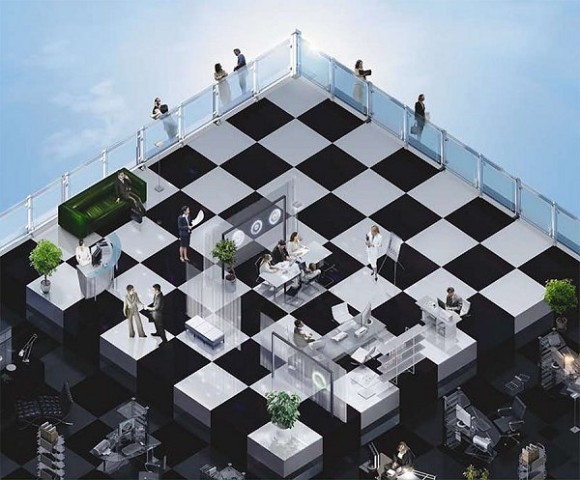
Just found this great advertisement done by one of the largest Russian mobile communication companies Megafon (which unfortunately, I never heard of). If you’ve been following our website from its very start, the photo below may look somehow familiar to you. Yes, we posted “The Terrace” optical illusion (article title: “Parallel World”) back in March 2006. But the most interesting part is that both of these are just a variation of an even older original. Let me explain this further…


Check out the thumbnail on your right. It has been cropped, but when you open it in full size, you’ll see the original artwork done by Sandro Del-Prete titled “Folded Chessboard“. This piece of art was created all the way back in 1975, and I’m still not sure how it managed to slip my attention when I posted complete opus of Sandro Del-Prete’s artwork.

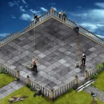
Anyway, “The Terrace” optical illusion we talked about earlier is JUST ONE in the sea of successful variations of Sandro Del Prete’s “Folded Chessboard”. If you browse the web, and search for Chessboard Illusions you will find dozen of examples. The Terrace was David Mcdonald’s first published illusion. It proved very popular in the last few years, and it can be found all over the web now. The most interesting part is that when compiling “The Terrace”, David took more than sixty purpose taken photographs, and used them to create this image you see on your left. I’m looking forward to hear you thoughts, and be sure to explain which of the three optical illusions posted today you find the best. Also, do you find “in depth articles” like this one I compiled today more interesting, or would you prefer more illusions per day but with less text? An idea struck my head to start posting new optical illusion every 6 hours or so, but then only few lines of text would accompany each article. Share your view on this, I beg you.
the ones with something on the outside of the fence at the top are better for me, because the bottom half of the pictures seem overpowering to the top (ie. I see the bottom half taking precedence in the viewing angle) in particular “The Terrace” which I think was the first one I saw anyway a while ago. and I’m not sure if I’ve seen the original Folded Chessboard one before or not, maybe I have :)
I like today’s illusion due to its modernness, and how clean it looks =) however my favourite is the terrace because of the guy on the ladder, this makes the top part of the illusion balanced with the bottom, for me.
i like your long articles but I also hate the wait between your illusions…it’d be best if you could post more illusions but with a decent amount of text. Not too much or too little… like maybe a paragraph…
I like Sandro del Prete’s illusion most, because it’s the most artistic.
And about the posts, I would like it better if you produce less posts, but with more text. I think the texts of all posts make this side unique. You also said once that it’s becoming more and more difficult for you to find good quality illusions every day, so if you’ll post even more articles, you might get even more problems with that.
I prefer waiting longer for an optical illusion with a nice explanation than having lots of optical illusions with no text. Anyone can post millions of cool pictures on a blog… you do research, and provide interesting facts and stories that keep your visitors visiting.
Also, we enjoy the little snippets of your life that you share with us; it makes you seem more human rather than just a geek on a blog :D
Josh – long time fan
I like more the “Folded Chessboard” illusion. I like playing chess and the illusion is more evident than in the russian ad. Nice post!
I like the long articles, if people don’t like your writing they can just ignore it and look the picture, for those of us interested in a bit more information about the illusion or similar ones, we can read it. I think the writing only adds to the enjoyment!
Please post more articles with longer in-depth text. The illustrations are mandatory of course but some per week will be enough…
I can’t decide if I like the Folded Chessboard more than The Terrace, but I don’t really like Megafon’s version. It’s almost too hard to see the illusion, the vertical lines of the ladders in Folded Chessboard and the ladder and rope in The Terrace really make the illusion pop.
I enjoy the background info that you provide on illusions, it makes the illusion more interesting. Also I like your personal tidbits, it’s a cohesion on what/why you post and adds dimension.
I think the one with castls on it are best illusion.
INSANE!!
Nah! Don’t post illusions every 6 hours! I’ll never keep up! It’s funner to wake up to a new illusion every day than to refresh your browser 6 hours later and find a new one waiting for you. Plus, all the endearing qualities and the charm from your texts will be gone if you just post only a few words with each image.
Can’t decide on my favourite – either the Terrace (clean and the ladders add interest) or the megafon ad (the glass panels along the top sides work as the edge of the folded balcony and also as on the same plane as everything else – the top half can flip back and forth between flat and folded).
I’m in agreement with the vote for your comments and insights. That adds a lot to this site. But it probably does not help you get through all of the backlog of illusions I imagine you have filed away.
I’ve sen this kind of a illusion a million times.. and it never gets old! I love trying to wrap my mind around it every time I see it!
:D
As originals are originals, nothing can beat the conception of the idea, I think the Terrace is the best, in terms of implementation of the idea, because it’s photographed instead of drawn.
As for the Megafon one, the lack of connection between the top and the bottom (like the stairs and rope line in the Terrace and the original) decreases its intended impact. It’s like two separate pictures put into one, that’s all.
This is a good post, Vurdlak! Good job! And I enjoy the articles. I admit I suggested in the past that you should hire a writer. And I stand by my opinion. You’re okay as a writer, especially when you’re adding tidbits and facts for some illusions. But the fact that English is not your mother language (hey, it’s not mine either, FYI) prevents you to choose better words or construct better sentences when you try to create a mystery or surprise around your illusions with your articles.
But all in all, I still prefer the article presenting one good quality illusion from several average (or bad) quality illusions wihtout any article.
IMHO.
Sorry if I seem to contradict myself. It’s typo. It should be like this:
“As originals are originals, nothing can beat the conception of the idea. But still, I think the Terrace is the best, in terms of…” bla-bla-bla.
For some reason, I missed typing that “But still” part. And upon rereading it, I also mistype “without” Dang! What’s with me today? =P
Not the stairs! Ladders! DARN!
But it just proves my point that English is not my mother language, I guess.
Sorry if I post too many today, correcting my previous comment. But for some strange reason, I make many mistakes today. =P
it seems every1 is speaking almost good eng (i mean like putting caps and all that). i just broke that chain HOORA! anyway i seen the terrace illusion b4, so i knew this illusion was originated from it. but what i didnt know is that there was a OLDER first version. nice nevertheless (good english D:)
I like a little explanation. Also, I like to read the comments sometimes, and if you change the illusion frequently, comments won’t be read (or, eventually, even written). This would be particularly true for when you have to “ok” comments from people, like me, who write while you are asleep. Often, my comments don’t get published when you change illusions rapidly.
I applaud the original picture and respect the work that went into the variations.
its shit!
I quite like the in-depth articles personally as also I like the articles with snippets of your life in and I think that your doing an amazing job to post an illusion pretty much every day and writing any text to you so do as you will but you dont want to try and over-work yourself on this when you probably have loads of other stuff to do. About this illusion I think the best is sandros’s origional as it is easier to copy someones illusion than make it your self (I also prefer the theme)
Hi, I like the texts.
From this post my favorite is the terrace, I find it more balanced than Delprete’s, Megafon’s instead is lacking the ladder, to me an essencial of this illusion. Keep on, and thank you.
I prefer the folding chessboard illusion best, as it has more detail than the terrace, and the advert is not so striking.
I agree with the other comments, I think that the explanations give the illusions meaning, and they would otherwise just be a collection of pictures.
The Terrace wins for me – the dichotomy takes longer to develop as you scan up or down (maybe a result of more squares), but naturally slips back to a terrace view. The ad comes at you as looking up at an overhang, the quickly cahnges to the office (but too noisy) and is then difficult to recreate the original impression. The folding chess board has a nice balance, but is limited by the choice od 8×8 squares.
M.C. Escher anyone?
I like the longer explanations, as they make it far clearer and more interesting
PLEASE continue your comments! from today’s post and, links from it, alone, I’ve discovered:
a worldwide compendium of impossible objects and their artists, (http://im-possible.info), the very odd mind of Harry Rowohlt, Photography artist Chema Madoz, (http://www.chemamadoz.com)
artist and poet Joan Brossa,(http://www.joanbrossa.org),
and from a link from a page about Joan Brossa-(soap bubbles being a lifelong passion of mine) SoapBubbler.com, with articles and links to videos on soap bubble artists around the world.
Your notes about your life remind me that this site is not the product of a faceless mega-corp, but of one very brilliant human. Also, how much work is involved in producing this site- not just finding the illusions, but the computer knowledge and time spent finding sponsors so we may enjoy all this free.
oh-as for the illusions today, del Prete for me- it’s the original, and was created before Photoshop!
Hello,
I like the first picture simply because it baffles me to think that is an ad for something?
But, what I really want to write here is that, by all means, continue the explanations and history. Sometimes, (i’m a little slow I guess) but I really don’t get the pictures until there explained. Also, I recently went to an exhibit in Tokyo entitled visual deception and discovered there is a long and interesting history to this kind of thing. So often we do see it in advertisement and thus public opinion of this art form is somewhat cheapened. I for one find it fascinating. thanks.
sorry, after reading some of the other comments I’d like to add that I read this from my.yahoo rss, and I don’t even get the text on my yahoo page unless I roll-over/click the link. Those who don’t want to read can just ignore, right.
look at https://www.moillusions.com/2009/06/still-no-luck-finding-jobs.html
I love optical illusions! These ones really mess with the mind inspiring the question, Which side is the top and which side is the bottom? It really could be either side.
SO Cool I really like this illusion!!!!
Thanks for your marvelous presentations. To answer your request: I would like you to vary in-depth articles with “more illusions @ day with less text”…the best of both worlds!