I have to start this post by saying that I have absolutely have nothing against Starbucks. I know nothing about the company’s practices and I’ve never even set foot in a Starbucks. I know, I know! In some areas, there’s apparently a Starbucks on every corner in some areas, but I live in a small rural area, nary a Starbucks in sight!
I’m a pretty big coffee addict, though, and in my humble opinion, any company that peddles mass amounts of tasty caffeine is okay in my book! I also know that there are some pretty hardcore Starbucks fans out there, and I really hope this Starbucks sucks image doesn’t get them all riled up…
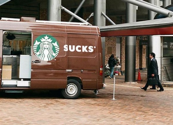
The way this van door is positioned, the Starbucks logo is right in front of the word “sucks”, hence Starbucks sucks. Obviously it doesn’t really say this, rather it’s just the way the door is positioned. The S on the beginning of Starbucks is on the actual door of the van, and when it opens, it gets positioned right in front of the “ucks” for this nice little Starbucks Sucks disaster.
I’m thinking that whoever designed this van didn’t think it through! What do you think?
I pretty much assumed this was a photoshop job.