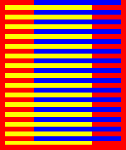
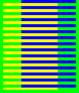
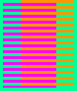
Arjen Goldschmidt has sent in what appears to be the best (proof-endorsed) color optical illusion I have seen up to date! Below examples showcase embedded lines of seemingly different colors. The reason they look different is because our brain judges the color of an object by comparing it to surrounding colors. So without us even knowing it, in first example, our brains compare the flowing red stripes to the yellow stripes, forcing us to think they are orange. The blue stripes make the red ones appear much darker -almost purple, even though they are exactly the same color! This is just one of the examples why you cannot trust what you see even with your own eyes. Next time someone swears they saw Jesus, UFO, or a ghost, show them this animation ;)
Hue is one of the main properties of a color, defined technically as “the degree to which a stimulus can be described as similar to or different from stimuli that are described as red, green, blue, and yellow” (those beeing the unique hues). The other main correlatives of color appearance are colorfulness, chroma, saturation, lightness, and brightness.
In painting color theory, a hue refers to a pure color—one without tint or shade (added white or black pigment, respectively). A hue is also an element of the color wheel. Hues are first processed in the brain in areas in the extended V4 called globs.
The bottom one works best for me :)
Wow, I really like this one. Interesting how our perception of color is influenced so strongly by surrounding colors.
very cool!
i know right it also hurts my eyes though
The yellow looks like yellow to me, the blue looks like blue, and the red looks like red. My eyes must be defective.
Mine too. I don’t get this one….
First Comment :D
WOW thats just Damnlol.
Thats just cool.
actually “Blax” there’s is like 4 more people who commented before you. Who cares who puts the first comment?????????!!!!!!!!!
Wow! I found the illusion was greatly enhanced when I looked at the widget without my reading glasses. The blue and yellow became almost indistinct for me and the orange and purple was greatly enhanced.
If you do not suffer from poor eyesight, you might be able to duplicate the effect by screwing up your eyes and blurring your vision.
Wow! These are good.
yay first one! btw this is nuts
first what?????????? comment???? Well,there’s like 5 people who commented before you.
FAILURE
Comments, who cares who is first?
The further away you are from the screen , the better you can see the colors .
I didn’t notice a change until I walk a few steps back .
I wonder what my dad would have thought of this. He’s color blind. Keep ’em coming.
hahaha great!! :D
I don’t know about this one. I just see red stripes all the way through. I stared at it for a long time before reading the description. Even then, still just red- definitely not orange.
That’s pretty cool O.o
Good but I’ve seen it be4!!
My eyes must be weird… They perceive no difference in the colors.
I like this illusion because multiple meanings are part of everyday life. In art especially, it would be nice to have a “UN Translator” available in one’s eyes so that all possible permutations would be visible at once. I am a bit surprised that Green is described as a “unique hue” since it is a combination of the unique hues, blue and yellow (which are also primary colors). Anyone have some information that I need to be accurate? That aside, this is a treat for the eyes.
The green-orange-magenta is the one that works best for me.
Try this on your color blind friends.
cool
With smaller images the illusion is even more clear.
[img]http://i39.tinypic.com/25iou88.gif[/img]
Now that has an effect on me, whereas the larger ones don’t
Where is the Illusion ?
Printing machines work like that for about a century …. the silkscreen process uses this exact method for separating CMYK colors.
I have been following this website for along time but it seems to me – youre out of material and therefore presenting us with more and more pretty ordinary concepts …..
Really disappointed !
OW it hurts!
This one is facinating, and it plays on the usual defects of the human eye just like the ones that you look at for a long time until the colors change. It also helps if you have an artistic eye for color in the first place, and possess the ability to focus on colors or to let your eyes wander over the properties of color. And for those that can’t see it, some people won’t be able to; it’s like the scrambled pictures that only pop out if you cross your eyes. I can’t see those, but this color trick works really well for me.
This has no effect on me…
dear doll of ayub only,i,m looking towards dr.victoria zdrok non stop with super optical waves only,
Wow this is great I can’t stop staring at it! If you look at the first two from sort of far away at at a slight angle it looks black and white
look at what haps wen u cros ur eyes
Clever! They all look different shades, when there actually the same