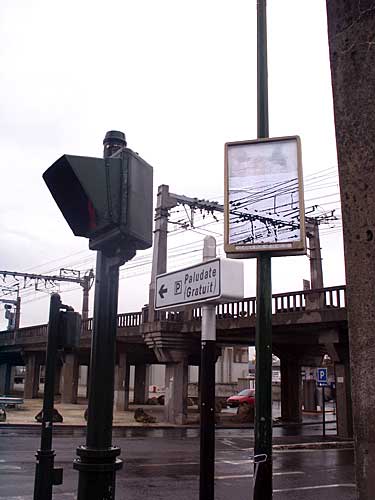
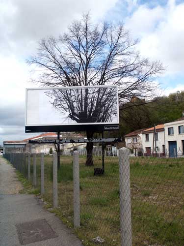
If you enjoyed Transparent Screens we posted already, you will adore this post. These are Transparent Billboards no.2 that were used in a campaign to protect nature and increase awarness. Be sure to check more of them inside this post, and in my Transparent Illusions Category, in the sidebar.


cool but to me kind of stupid
i dony get it
look cool, but what is the purpose again ??
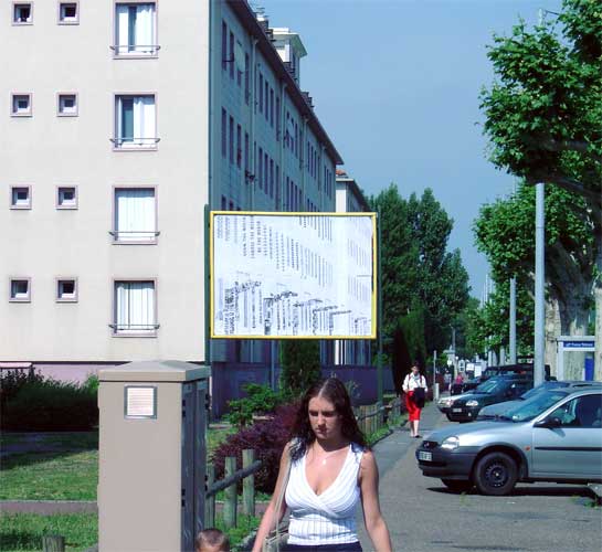
To be honest, they don’t really spread a message cos there are no words on the billboards. The worst one is the one with the yellow house in the background cos it doesn’t have anything to do witj environmental issues.
number 3 and 6 are a bit off, but they are still cool.
I prefer transparent billboards 1…
Finally a billboard the environmentalist’s will like.
omg they did this on my birthday!!!!
Do they show up at night?
eh? **waits for someone who knows what this is all about to make a post**
is that supposed to be the same just with more pollution?
Confusing. Not representative of their meaning.
i don’t understand…
i fell in love whan i saw them
and the point is???
1
2
3
I feel really stubid for not getting these…
Hey, these are pretty cool, HEY EVERYONE, THE POINT IS JUST THAT IT’s COOL, Use your noggin. Anyway, wouldn’t you have to be at the perfect angle to see it, Move two feet i na different direction and it will be out of line, so it must really comfuse the drivers.
ah you gotta love two layers in a photo program and erasing the top layer so the bottom layer shows
mybrain hurts(faint).
i don’t understand what you guys don’t get…..they are painted to look like the background so they appear to be “transparent” like you can see thourgh them. and the point is you should appreciated the artists that work on these….and if you don’t get it then don’t look at them…
My opinion is they are awesome! wether they are photoshopped or not :D
Interesting, but I feel it’s a bit lack luster. I know how he did it and I commend his work, but there’s a lack of contrast in these photos. There isn’t much to see and unfortunately, I’m not too impressed.
By the way, Forgetmaenot, that’s not how you do it. Good try though.
read the intro dummy.
They are advertisements that feature a picture of the background behind them.
It grabs the attention of your eyes and brain. Its like scrolling through a paragraph quikly and being able to find the one misspelled word.
Your brain picks up the fact that the pattern is different, so it makes you pay more attantion to it whether you want to or not.
like the word “quikley” in my paragraph above
Okay,, it’s not bad or something, but; what’s the sense in this?
I’m with everybody else
yawn:) this is lame
Err,this was quite interesting but I’ve seen better illusions.
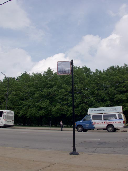
We have these where i live in the UK. The whole point of them is that they show up in the night, and the day. And on the pole thing that holds them up there is a MASSiVE button that, when you press it brings up the writing on the sign. They are used for Bus Stops.x
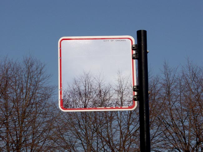
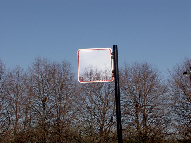
These are all photoshopped. not talented artists, or pressing a button to make the words appear. its quite obvious. and pic#3 doesnt even line up right because it was photoshopped using a part of pic#6. Not even talented photoshoppists (is that a word yet?)
I was going to say isn’t it illegal to paint over public signs like that? Then I read Holly’s post of a big button that lights up the sign. That’s really cool, I thought it was some random person that did these, not the town/city/whatever itself.
i think these signs are transparent so it shows through
looks like a good use of the new content aware in cs5 lol
yea, that’s kinda dumb. not very interesting. YAWWNNN
what is with people saying these are photoshopped??? read the words…
these are really awesome, and the whole pressing a button thing is really creative…