If you observe this picture from small distance, you will notice that the name of our german “maedchen” UTE, is acctually written in straight letters, instead of itallic ones… Jump inside this article to see the proof!

Here are the screenshots of the same image, only this time photoshopped with adjusted contrast:
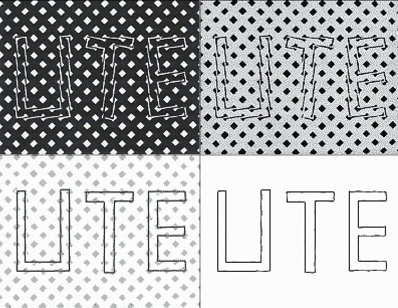
In a same way following picture isn’t composed of italic letters:

WORD
wow that’s awsome
That’s awesome.
hahah myspace
whoa thats tite!!!!!
you just need to cross your eyes a bit…
Nice name Mr. T! I watched that show(the guy has an outfit on :P)
the e in life looks weride, but cool
izz nizze
i love sea turtles! thats you squirt
Sorry not to agree that this is what is described. Those “straight lines” are straight, but they are not solid either. They are diagonally striped, though at a steep angle. If it were just solid diamonds and solid lines for the letters, I’d be more impressed. If you zoom in you cans see why the eye is tricked. kinda like my crude example below:
|\ |
| \ |
| \|
|\ |
| \ |
| \|
Really cool.
Don’t see anything…
i read it as LITE. lol
i read it as LITE. lol. Double Illusion.